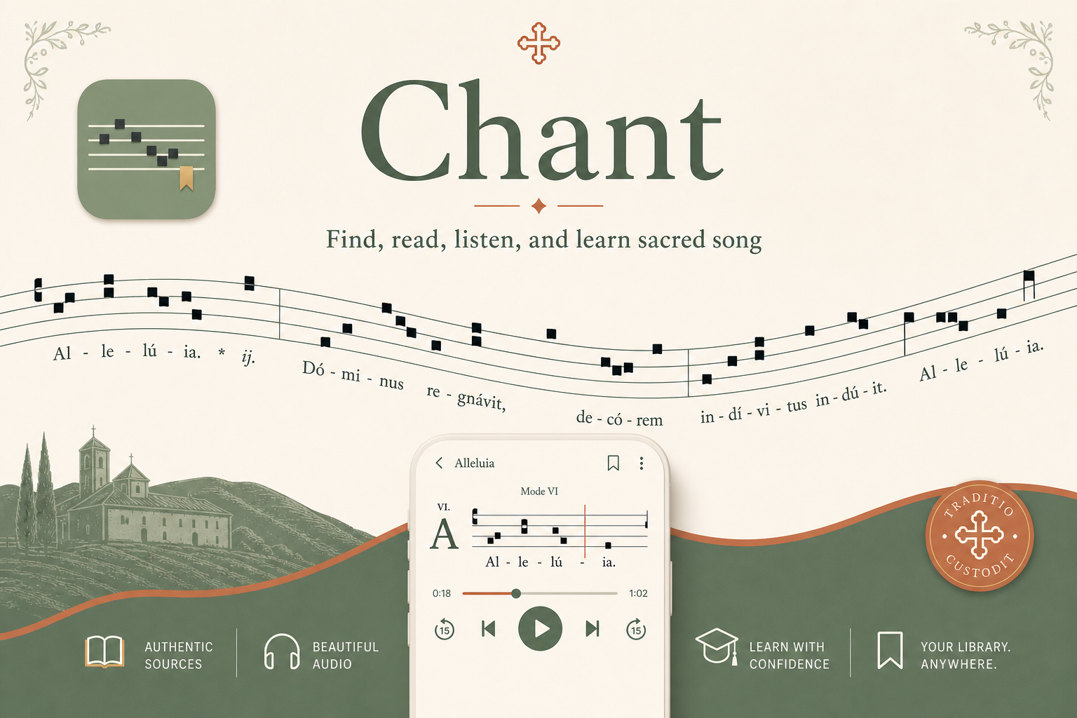
Web and app style guide. A rule set for building consistent product screens, not a collection of design ideas.
01 - Foundation
What This Guide Is For
This guide defines the visual and interaction rules for the Chant website and app. Every screen should be built from these roles and tokens before introducing illustrations or marketing artwork.
Use roles, not vibes
Choose colors, type, spacing, and components by their job: page background, surface, text, action, border, status, or notation.
Keep chant readable
Notation, Latin text, controls, source attribution, and metadata must remain legible before any decorative layer is added.
Extras come last
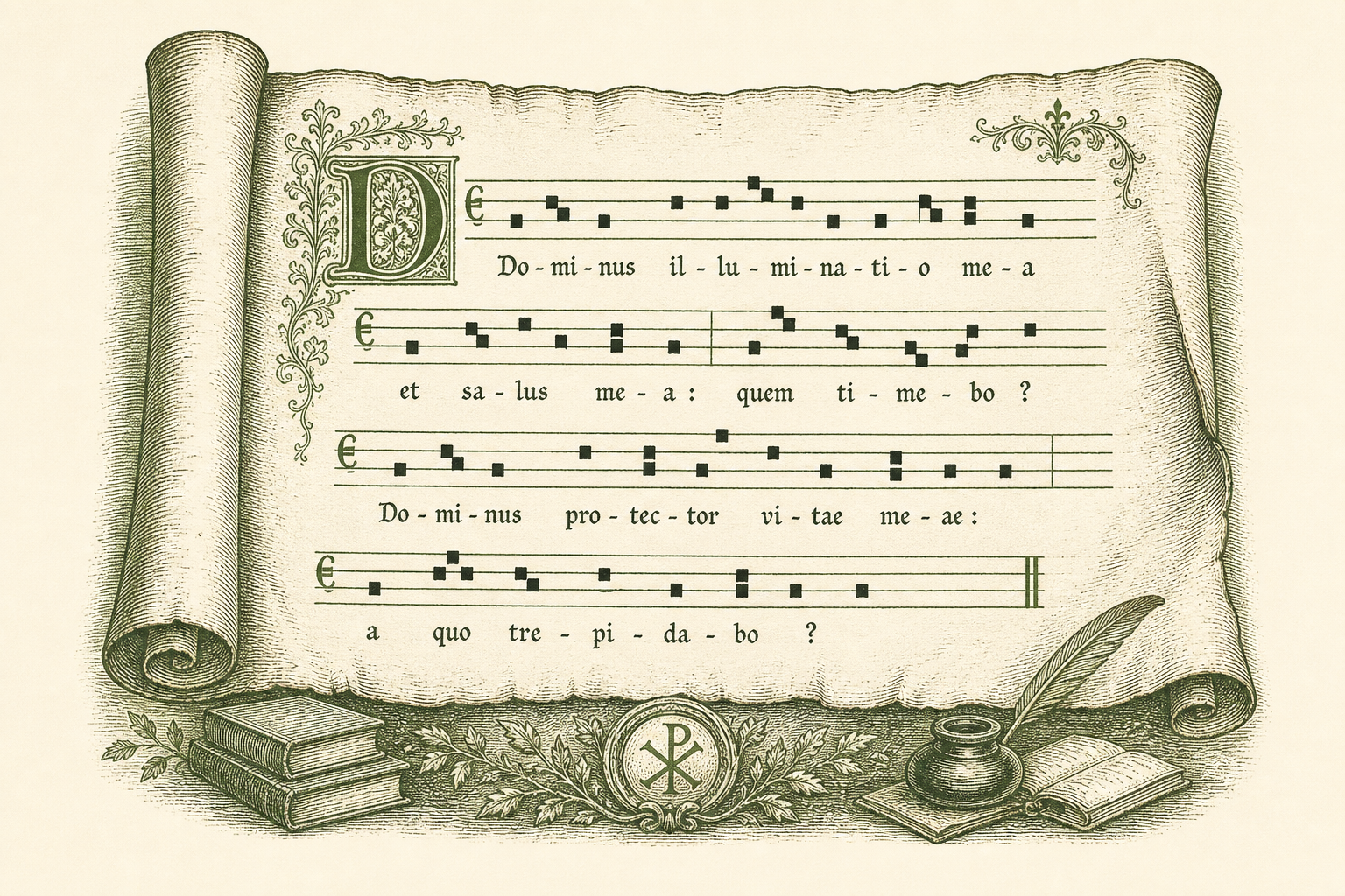
Illustrations, seals, borders, and campaign layouts support the product. They do not define the core interface rules.
02 - Identity
Logo, App Icon, and Naming
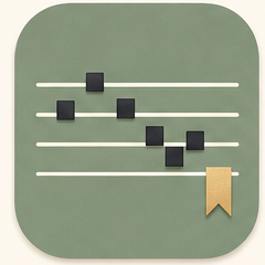
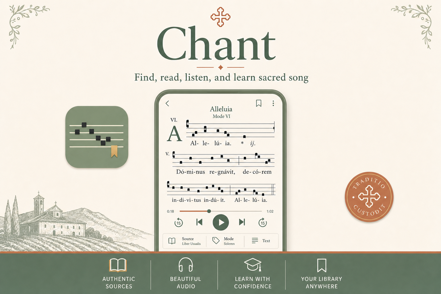
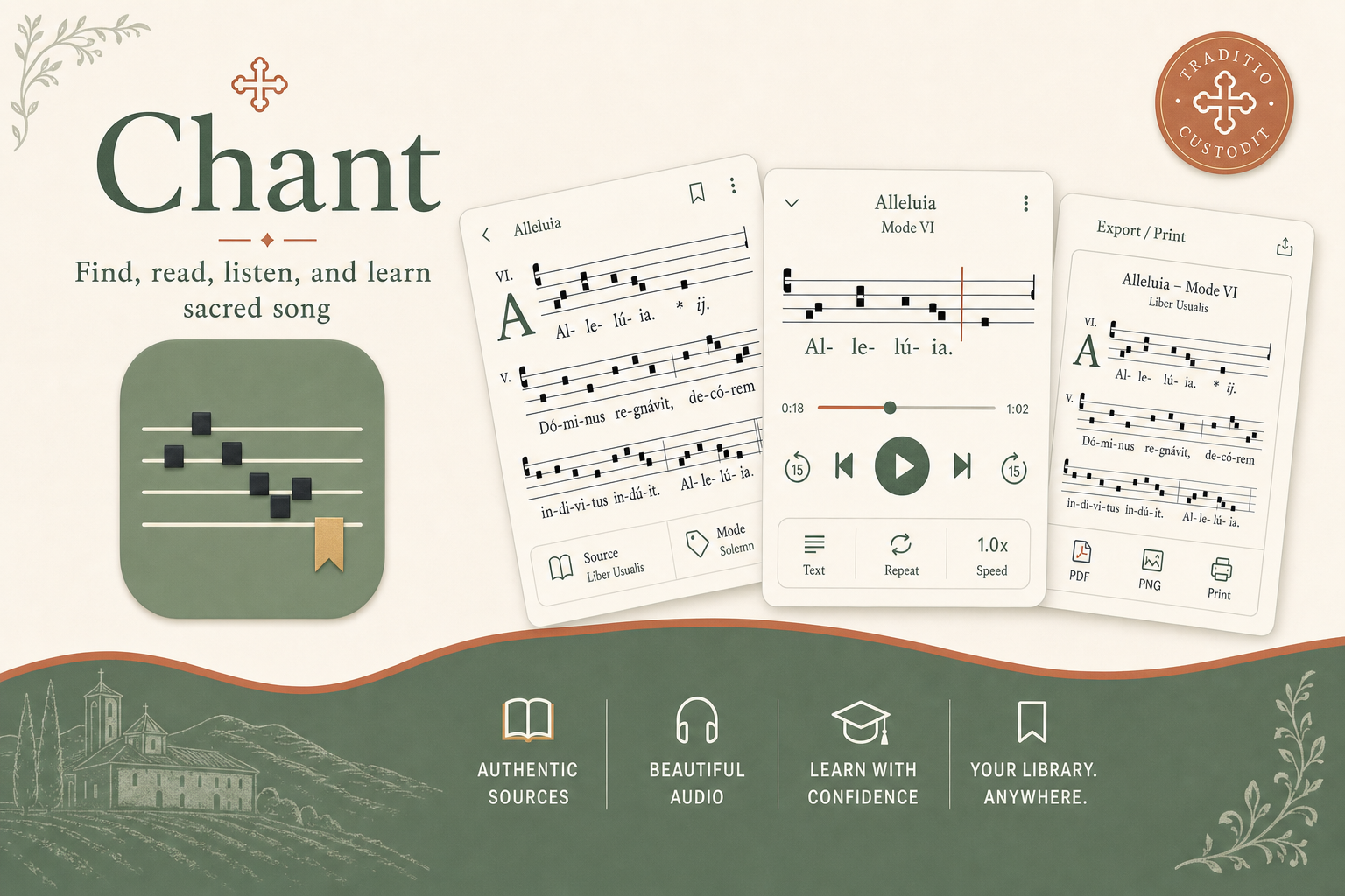
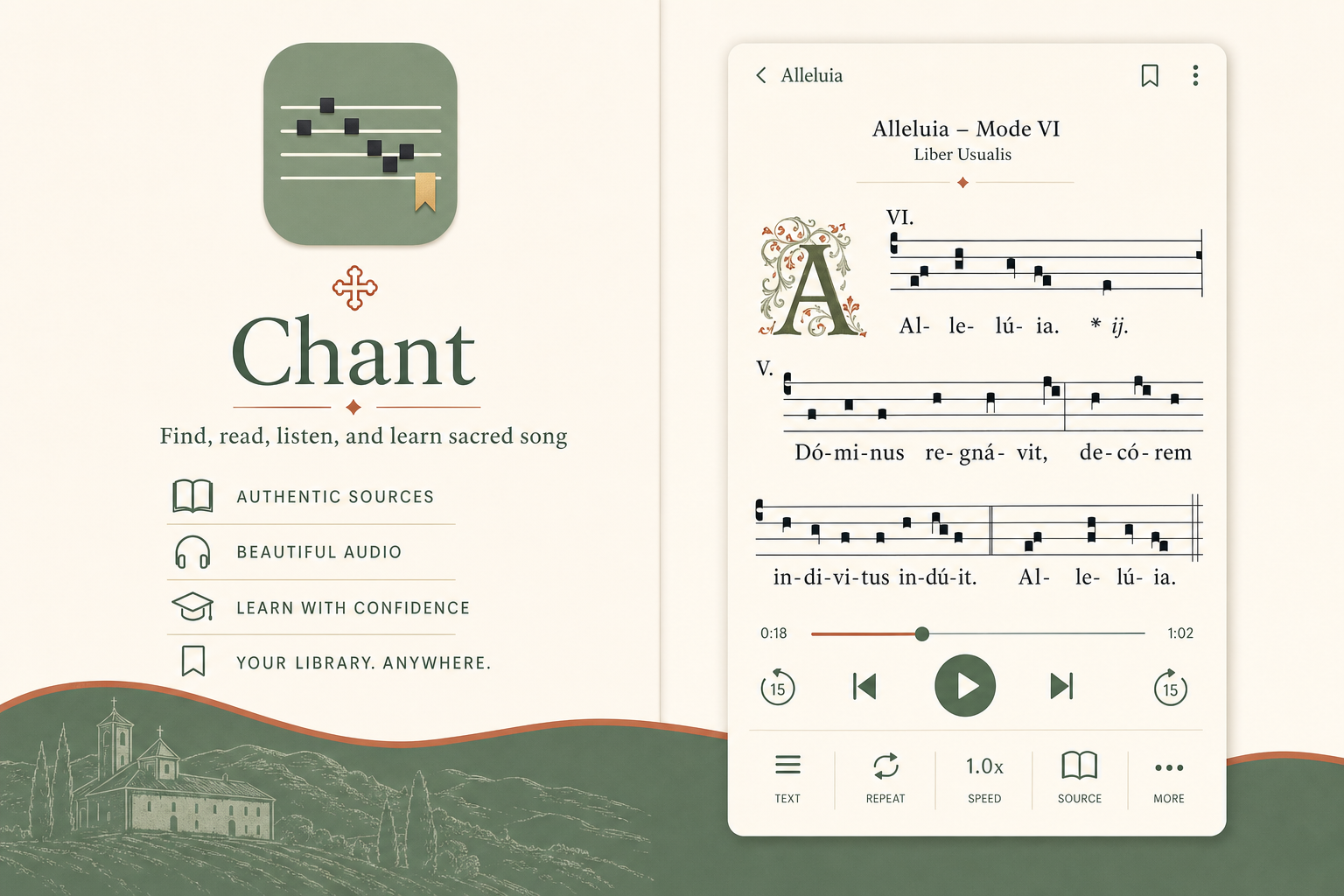
The primary identity is the app icon plus the name Chant. Use the icon as a finished asset; do not rebuild, recolor, or reinterpret it in product UI.
Primary lockup
Icon + "Chant"
Use in app headers, landing pages, onboarding, and footer credits when space permits.
Icon only
design/assets/icon.png
Use for app icons, favicon variants, compact navigation, and store/social avatars.
Clear space
1 staff height
Keep empty space around the icon at least equal to the vertical distance between two staff lines.
Do not
No variants
Do not stretch, rotate, recolor, add shadows inside, remove the bookmark, or place over busy images.
03 - Color System
Color Roles
Colors are defined by function. Use the token that matches the job on screen; do not choose colors decoratively.
Page background
#F3EFE2
--c-cream
Surface
#FAF7EF
--c-cream-raised
Primary text
#2F3327
--c-ink
Heading text
#3C4A32
--c-forest
Brand surface
#6F7D5E
--c-sage
Action
#B5673F
--c-terracotta
Highlight
#C9A24B
--c-brass
Border
#D9D2BF
--c-rule
Page background
--c-cream
Use as the default page canvas for web and app. Do not place dense text directly on image or illustration backgrounds.
Surface
--c-cream-raised / --c-parchment
Use for cards, panels, controls, wells, and sheet-like areas. Parchment is a subtle alternate surface, not a brand color.
Text
--c-ink / --c-forest / --c-muted
Use ink for body and notation, forest for headings, muted only for secondary metadata. Do not use muted for essential labels.
Brand
--c-sage / --c-sage-deep
Use for brand surfaces, selected states, app icon background, and major product framing. It is not the default button color.
Action
--c-terracotta
Use for primary actions, links, progress, focus emphasis, and active affordances. Each screen should have one primary action color.
Highlight
--c-brass
Use sparingly for the bookmark motif, small highlights, and important accents. Do not use for body text or large fills.
Notation
--c-ink / --c-staff
Square neumes stay ink; staff lines stay staff. Notation should not be recolored for decoration.
Use only on darkened art/photo hero areas, especially chant detail pages. These preserve the transparent tag treatment already used in the reader.
04 - Typography
Type System
Typography must cover marketing pages, app navigation, chant reader screens, tutorials, metadata, tables, and controls. This style guide uses the same hierarchy it defines here: large serif headings for reading context, sans-serif text for operating the interface, and a separate chant text role for Latin/notation-adjacent text.
Font Families
Reading serif
--font-serif
Use for brand name, page titles, section headings, body prose, tutorial content, and reflective/source-aware text.
Product UI sans
--font-sans
Use for navigation, buttons, labels, controls, tables, filters, tabs, metadata, and dense product surfaces.
Chant text face
--font-chant
Use for Latin chant text, syllables beneath notation, chant excerpts, and text aligned to musical phrases.
Current Product Type Roles
Masthead title
Serif, 2.1rem, 600
Use for simple site/page mastheads.
Catalog browser
Compact app title
Serif, 1.45rem, 600
Use where the app needs a smaller page title above controls or data.
Mass Ordinary
Chant hero title
Serif, clamp(2.2rem, 5vw, 3.4rem), 600
Preserve for chant detail pages with sacred-art hero backgrounds.
Kyrie I
Section label
Sans, 0.72-0.78rem, uppercase, tracked
Use for section kickers, card group labels, and control labels.
View
Body copy
Serif, 1rem, 1.5-1.6 line-height
Use for tutorials, descriptions, notes, source explanations, and normal reading.
Gregorian chant is the Church's oldest living music. Body copy should remain calm, readable, and close to the existing site.
Reader text
Serif, 1.05rem, 1.65 line-height
Use for Latin, English, Spanish, and bilingual text views.
Lux et origo. Kyrie eleison.
UI control text
Sans/inherited, 0.88-0.9rem
Use for buttons, selects, filters, menus, and transport controls.
Square notation · Export · Play
Metadata and captions
Sans, 0.8-0.85rem, muted
Use for source attribution, stats, secondary notes, and quiet metadata.
Source: Liber Usualis · Mode VIII
Tags / badges
Sans, 0.72rem, uppercase, tracked
Use for compact browse tags and inventory badges.
Ordinary · Available
Hierarchy Rules
Page structure
Display -> H1 -> H2 -> H3
Do not skip visual levels to make text look nicer. Choose the semantic level first, then apply the matching role.
Serif vs sans
Reading vs operating
Use serif when the user is reading; use sans when the user is operating the product.
Uppercase
Labels only
Uppercase is reserved for short metadata, navigation labels, and kickers. Never uppercase paragraphs, chant text, or long headings.
Line length
60-75 characters
Keep prose columns narrow enough for reading. Dense tables and controls may be wider because they are scanned, not read continuously.
Mobile scaling
Clamp display, preserve body
Display text may scale down. Body text should stay at readable size; reduce layout density before reducing body copy.
Do not
No decorative mixing
Do not introduce new fonts, random weights, custom letter spacing, or color-based hierarchy outside these roles.
05 - Layout, Margins, and Spacing
Layout Rules
Product screens should feel spacious and quiet, but the spacing must come from a repeatable scale.
Web container
Max width: 1120px. Page gutters: 16px minimum, scaling to 32px on wider screens.
Never let content touch viewport edges. Mobile uses at least 16px horizontal padding.
Section spacing
--sp-8
Use for major vertical breaks between guide/app sections.
Card padding
--sp-5
Use 24px for standard cards; reduce only for dense tables or mobile constraints.
Component gap
--sp-3 / --sp-4
Use 12px for tight controls and 16px for normal groups.
Radius
--r-sm / --r-md / --r-lg / --r-pill
Use medium radius for cards, pill radius for buttons and tags, large radius only for major feature panels.
06 - Interaction
Interaction Rules
The live site depends on small, fast feedback. Preserve these states, especially in the editor where focus, synced status, menus, and segmented controls carry meaning.
Buttons
Hover shifts border/text to action color. Disabled keeps layout, lowers opacity, and removes pointer behavior.
Field Focus
Document name
Inputs and selects use accent border plus focus ring. Do not remove the ring.
The GABC editor uses monospace text, focus ring on the wrapper, and an inset accent bar when synced.
Export Menu
Full page PDF
Cropped PNG
MIDI unavailable
Menus float above the plane, group actions, and keep disabled options visible but subdued.
Segmented Controls
SquareModernText
Use a single filled active segment. Inactive options stay quiet and legible.
Motion Timing
Use --motion-fast for progress/pressed changes, --motion-base for hover/focus, and --motion-slow for card lift.
Hover
--motion-base
Use 0.15s color/background/border transitions. Avoid slow decorative easing on product controls.
Focus
--shadow-focus
Inputs, selects, color boxes, textareas, and editor wrappers must have visible focus.
Disabled
opacity + default cursor
Disabled actions remain visible for orientation but should not invite clicks.
Editor feedback
focus ring + inset bar
Preserve synced/dirty/rendering states. They are functional, not decorative.
Loading/rendering
reserved space + brief opacity
Reserve space and use short transitions so notation/editor updates do not jump.
07 - Elevation and Shadows
Shadow Rules
The current site uses shadows well when they clarify depth: cards lift slightly, menus float above controls, art heroes recede, and notation paper reads like a sheet. Preserve that hierarchy.
Card
--shadow-card Default cards and quiet panels.
Hover / selected lift
--shadow-hover Browse rows, interactive cards.
Popover
--shadow-popover Menus and floating panels.
Hero
--shadow-hero Art-backed chant hero panels.
Notation paper
--shadow-paper The floating manuscript sheet.
Focus
--shadow-focus Keyboard and form focus rings.
Subtle by default
--shadow-card
Most surfaces should use a barely-there shadow plus a border. Do not make every card look like a modal.
Interactive lift
--shadow-hover
Use when hover/selection benefits from depth, especially browse cards and rail items.
Floating layers
--shadow-popover
Use for menus, dropdowns, and panels that sit above the page plane.
Reader surfaces
--shadow-hero / --shadow-paper
Preserve the deeper shadows on chant hero art and notation paper; those shadows separate reading layers.
Print
none
Remove decorative shadows in print/export contexts.
08 - UI Components
Interface Rules
Components should be copied from the existing product patterns before inventing new variants. Library category cards and chant rows are canonical interactive UI surfaces.
Buttons
Primary button
--c-terracotta
Use once per local decision area. Examples: Listen, Save, Export.
Secondary button
--c-sage
Use for supportive actions. Do not compete with primary action.
Ghost button
border + text
Use for navigation, cancel, and low-emphasis actions.
Library Category Cards
Default
art card + scrim
Use real category art, dark left-to-right scrim, serif title, uppercase sans metadata.
Hover
image brightens + scales, card lifts
Preserve the subtle motion: image scale to 1.06 and card translateY(-1px).
Active
inset accent + left rail
Active category uses inset accent outline, strong shadow, and a 4px left indicator.
Rows are interactive links when available. Preserve the play circle and italic incipit.
Hover
soft action wash + play fill
Hover changes row background and fills the play circle with the action color.
Unavailable
opacity + default cursor
Unavailable rows stay visible but do not act like links; hover should not imply action.
Tags and Metadata
Mode VIIntroitAdventSource
Mode VIIIUsage Mass OrdinaryGenre Kyrie
Solid pill
--c-success-soft / --c-terracotta-soft
Use on normal cream/card surfaces for filters, categories, table metadata, and browse pages.
Transparent tag
--overlay-panel / --overlay-border
Use on art-backed or dark overlay surfaces, especially chant hero metadata. Do not use solid pills over hero artwork.
09 - Reader Screen Patterns
Chant Detail Rules
The chant reader has product-specific patterns that should be preserved. It needs enough atmosphere for sacred art and enough discipline for score reading, playback, and source metadata.
Hero With Transparent Metadata
Mass Ordinary / Kyrie
Kyrie I
Lux et origo. Metadata should float over the hero image without becoming opaque blocks.
Mode VIIIUsage Mass OrdinaryGenre Kyrie
Hero title
clamp(2.2rem, 5vw, 3.4rem)
Preserve the large serif title over art for chant detail pages. It is a reader/chant-title role, not a generic marketing display.
Hero incipit
serif italic, 1.08rem
Use italic serif for chant incipits or short Latin excerpts beneath the title.
Transparent tag
--overlay-panel / --overlay-border
Use translucent tags over art or dark image overlays. Do not replace these with solid product pills in the chant hero.
Overlay text
--overlay-text / --overlay-muted
Use overlay text tokens on art-backed surfaces only. Do not use regular ink/forest on image overlays.
Notation Paper
The chant score itself is generated by the notation renderer inside .notation-paper. Do not use static staff artwork, mock SVGs, or decorative notation images as a substitute for the real rendered output.
Real source: chant.html renders into #chant-container / #modern-container inside .notation-paper.
Paper width
--paper-width-letter: 8.5in
The notation area should preserve a letter-page mental model for reading and export.
Paper margin
--paper-margin: 0.75in
Use 0.75in margins for score rendering so notation aligns predictably with print/export output.
Notation font space
renderer-owned
Do not force normal UI typography into rendered score SVGs. Keep square notation and aligned syllables controlled by the notation renderer.
Text view
1.05rem / 1.65 line-height
Preserve generous line-height for Latin, English, Spanish, and bilingual text views; these are reading surfaces, not dense controls.
10 - States and Accessibility
Accessibility Rules
The style system must remain usable with keyboard, screen readers, and low-vision settings.
Focus
Interactive controls need visible focus. Use the action color or a high-contrast outline; never remove focus styling.
Contrast
Use ink or forest for text on cream surfaces. Do not use brass, staff, or muted colors for primary copy.
States
Every interactive element should have default, hover, focus, active, disabled, and selected states where applicable.
Alt text
Meaningful illustrations need descriptive alt text. Decorative dividers and flourishes should use empty alt text.
11 - Content and Voice
Voice Rules
The product voice is reverent, clear, and source-aware. It should welcome newcomers without flattening the tradition.
Reverent
Treat chant as sacred music, not novelty content.
Clear
Use plain language for navigation and actions.
Faithful
Attribute sources and avoid invented metadata.
Say
Approved phrasing
"Find, read, listen, and learn sacred song." "A living library for Gregorian chant."
Avoid
Tone limits
Hype, exclamation overload, casual jokes around sacred text, or claims not backed by source data.
12 - Appendix
Extended Assets
Use these after the core system is in place. They add character; they are not substitutes for layout, color, type, and UI rules.
Notation
No static notation mockup is included here. Product notation must be generated from chant data by the site renderer, the same way it appears on chant detail pages.
For real notation output, open a chant detail page such as chant.html#1143.